Boston updates plans to become a zero-waste community
Nov. 21, 2019
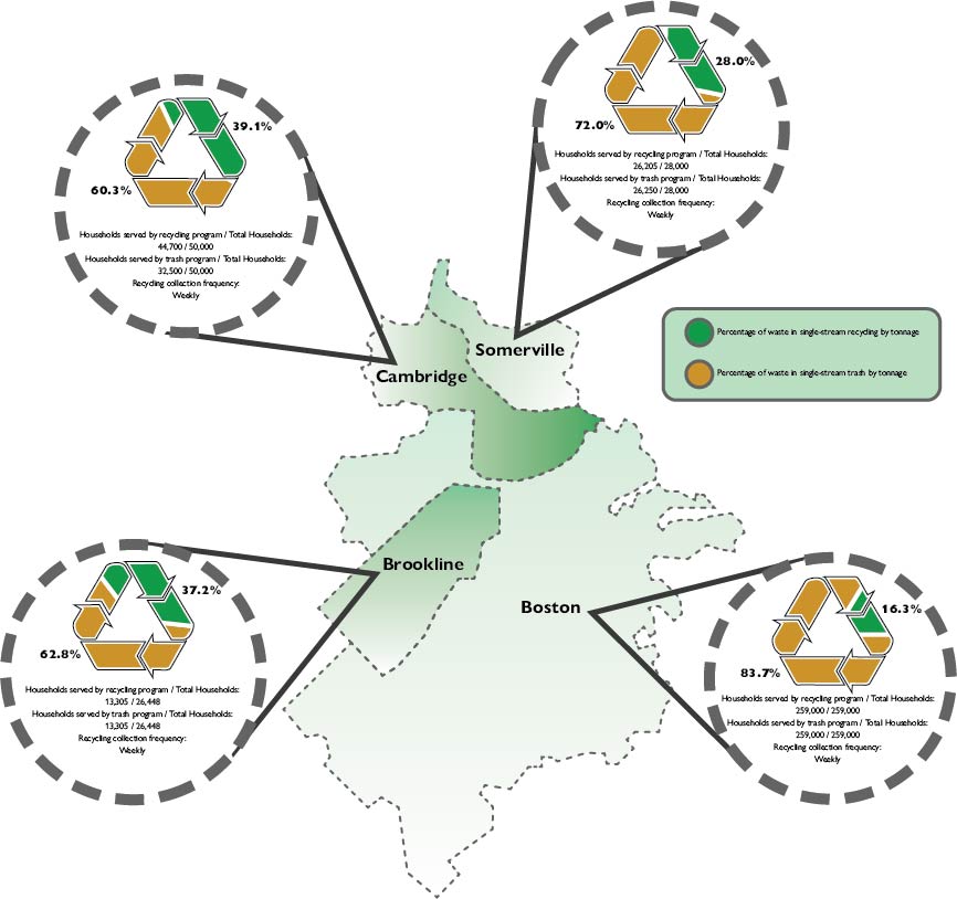
To accompany an article about changes to the city of Boston’s plan to become zero-waste and increase its recycling I produced a data visualization examining data about rates of recycling in communities in the metro-Boston area.
Donut charts designed to look like the recycling logo indicated the percentage of households served by recycling programs in contrast to trash programs in Boston and three neighboring municipalities. A map graphic provides a background for the donut charts, as well as another way of encoding the data; the opacity of the color within the municipality on the map reflects the percentage of households served by the recycling program, with darker shading representing a greater participation in the program.
Data for the graphic was processed in Microsoft Excel, where I also created preliminary visualizations. I then transferred the graphics to Adobe Illustrator to do further design work.
